Scripture Labs: Design System
Challenge
Improve the design of a digital learning tool to help increase user retention.
Outcome
Designed a framework to improve cohesion, logic and usability. Frameworks will continue to grow and scale with the product.
My RolesResearch, UX, UI, design system
Team1 Developer, 1 Writer
Background
The Product
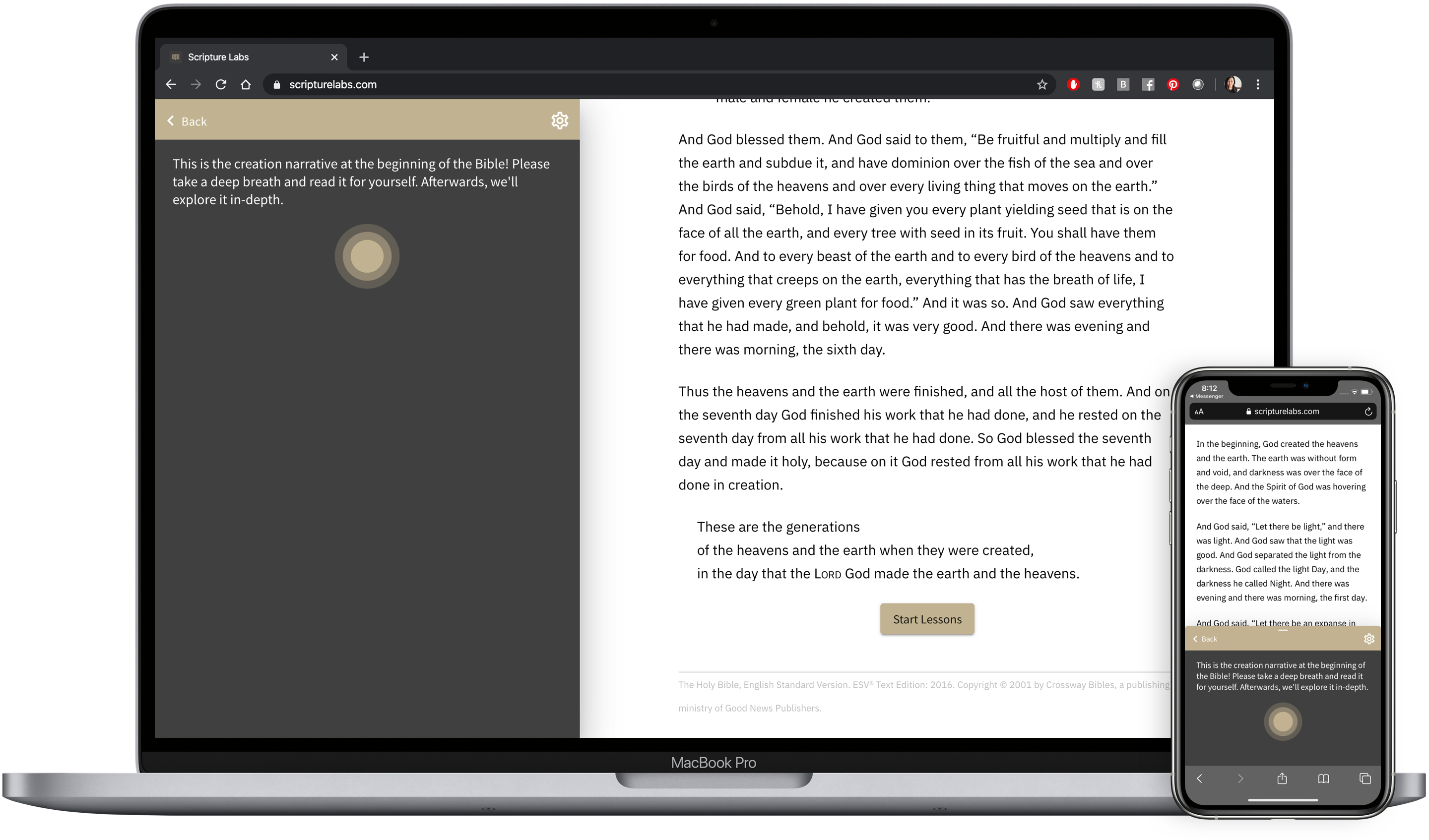
Scripture Labs is a web-based interactive Bible study tool. It offers guided analysis, historical context and activities to teach users how to read and interpret the Bible.
At the time I joined, the product was in a beta release. It contained only 1 lesson, and had feedback from about 20 users.
User Research
Engagement Metrics
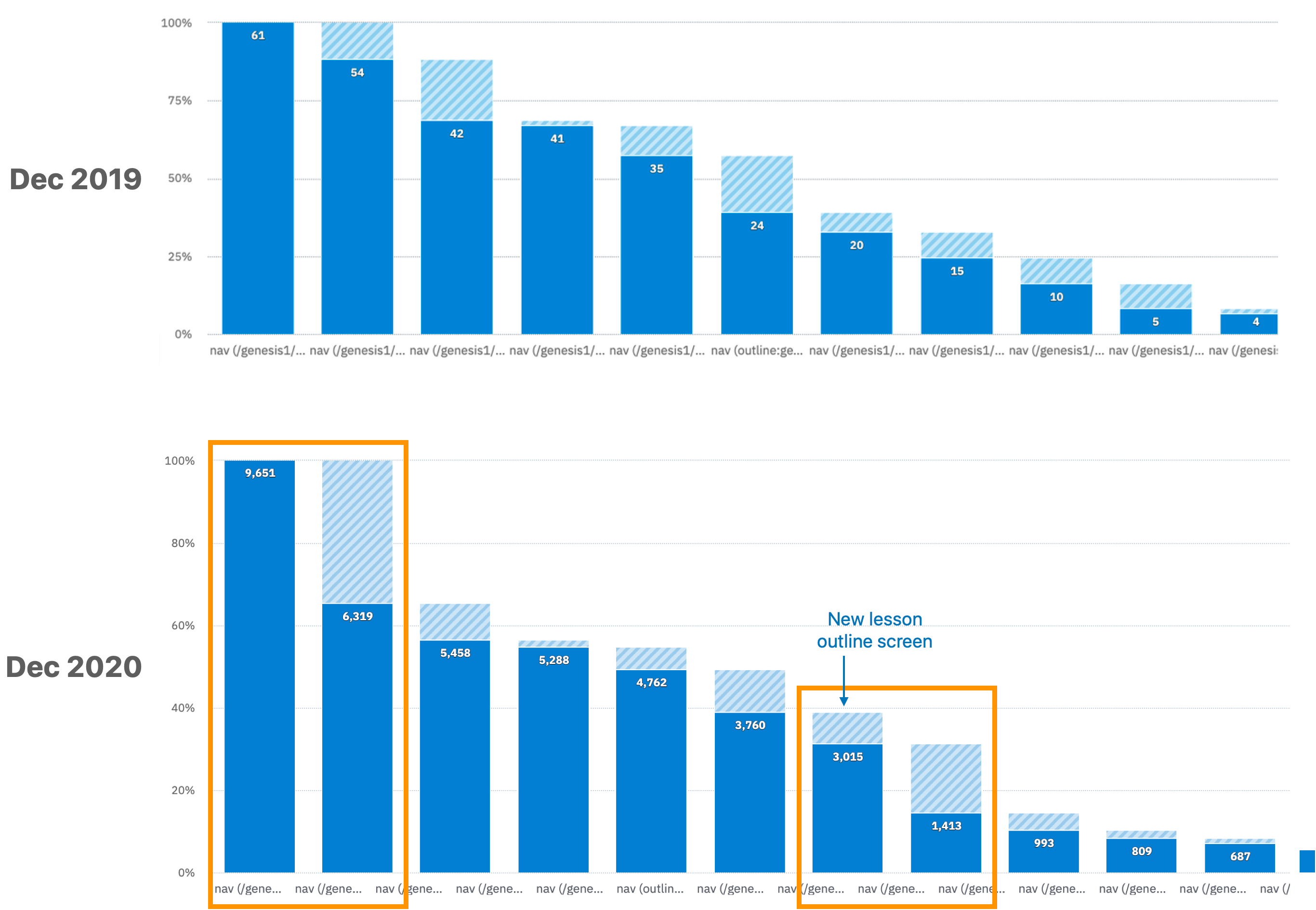
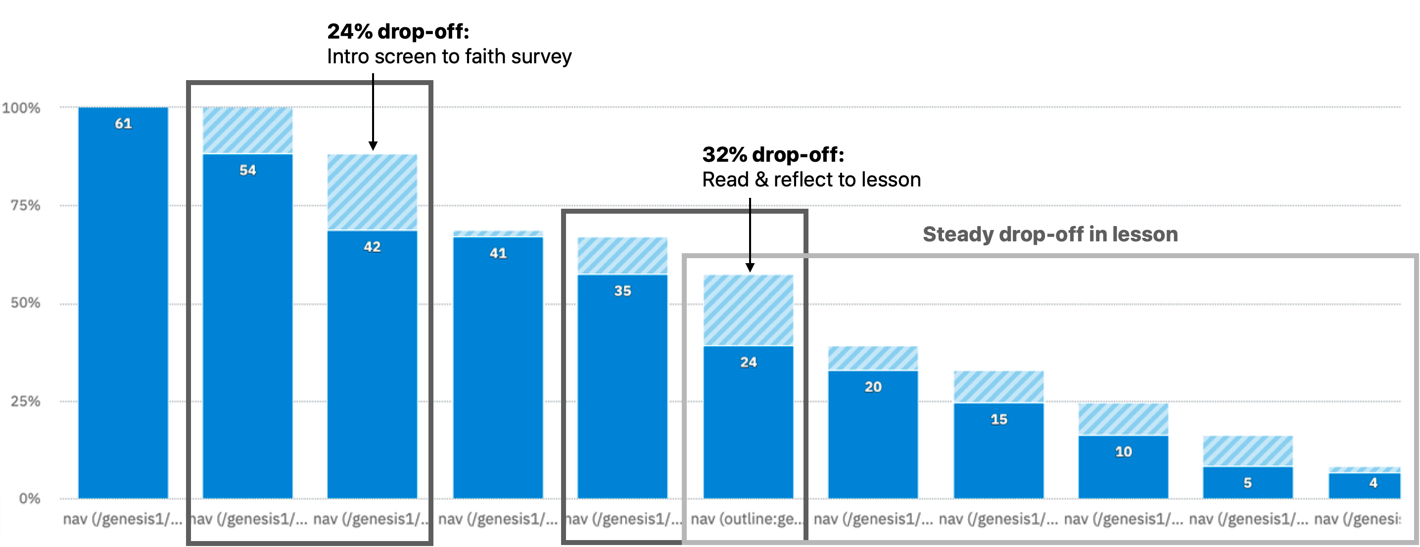
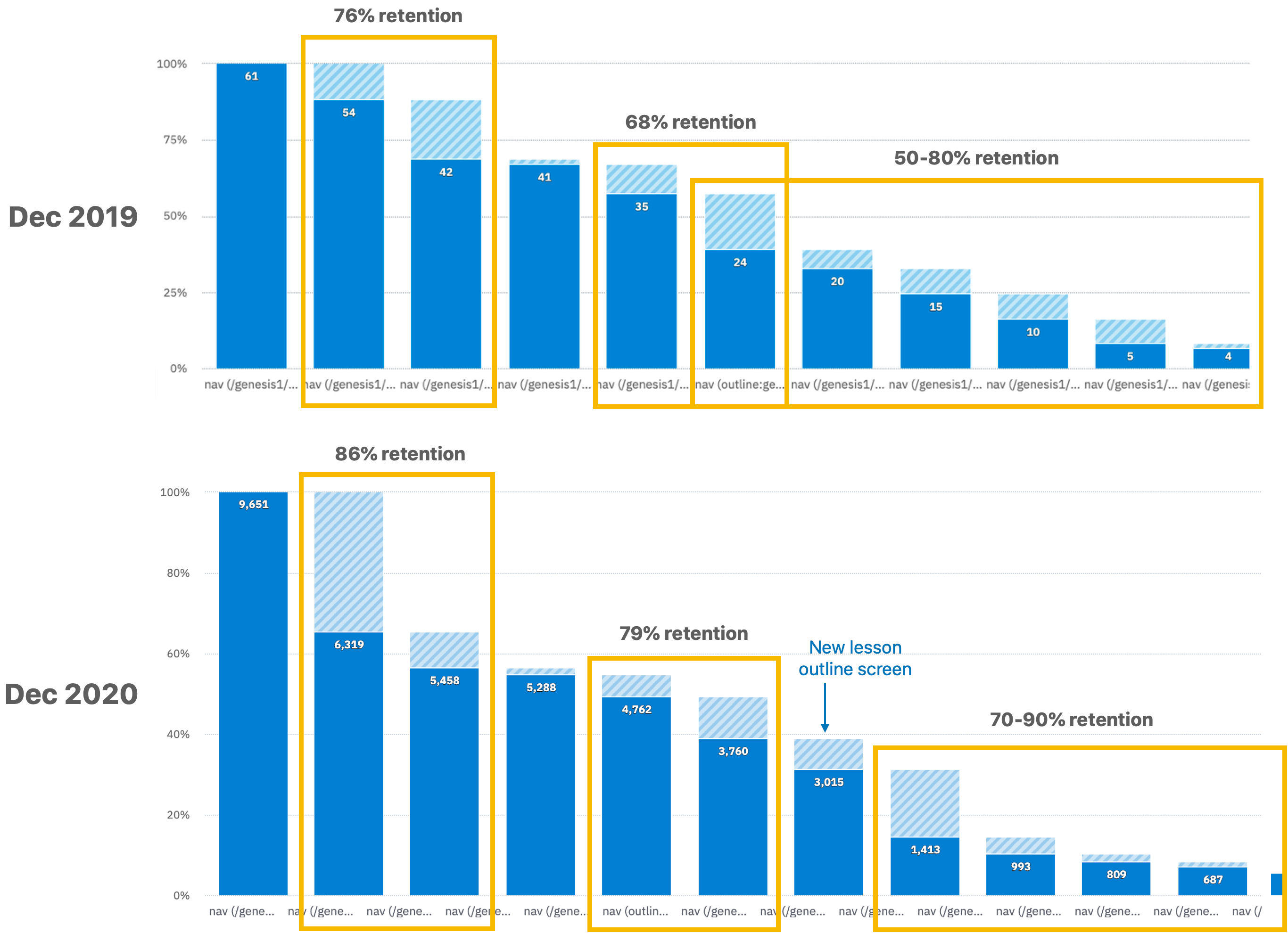
The team had tracked engagement data on the beta release using Amplitude. We noted a couple of sharp drop-off points to investigate.
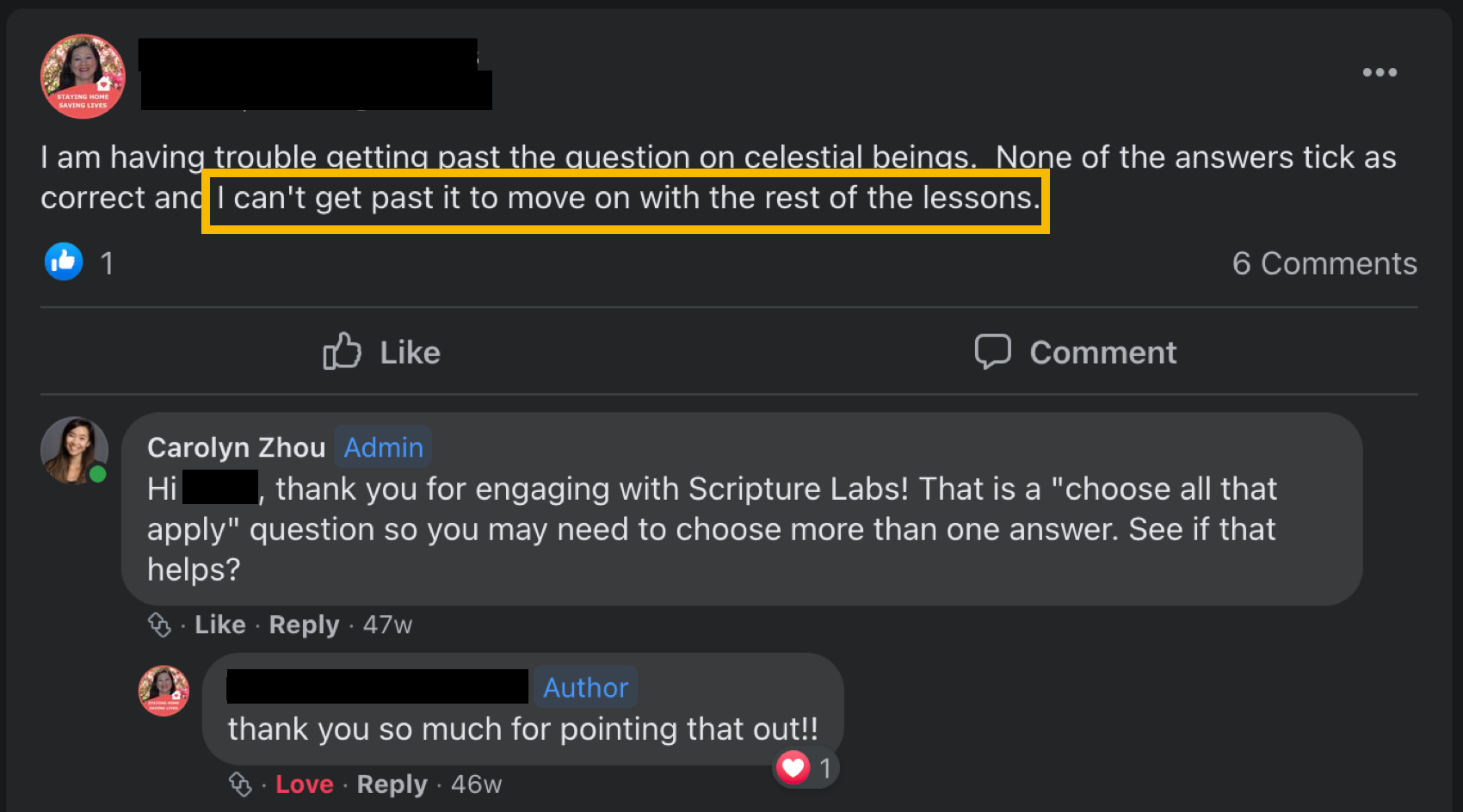
Feedback
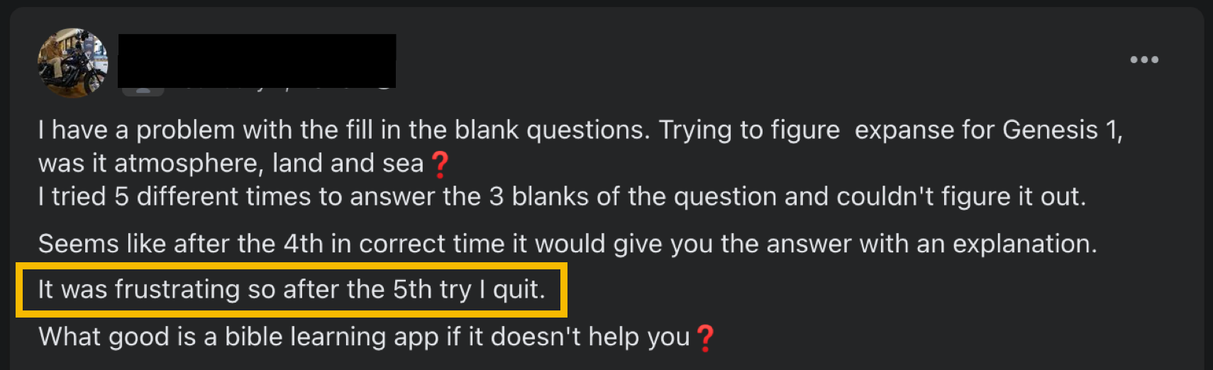
We also had verbal feedback from user tests and from SL's Facebook discussion page. Many of the comments were about the user interface and experience. Because the user pool was small, we were able to connect directly with many of them and ask about their experience in-depth.
I can't tell how long the lesson is, so I don't want to start and not finish.
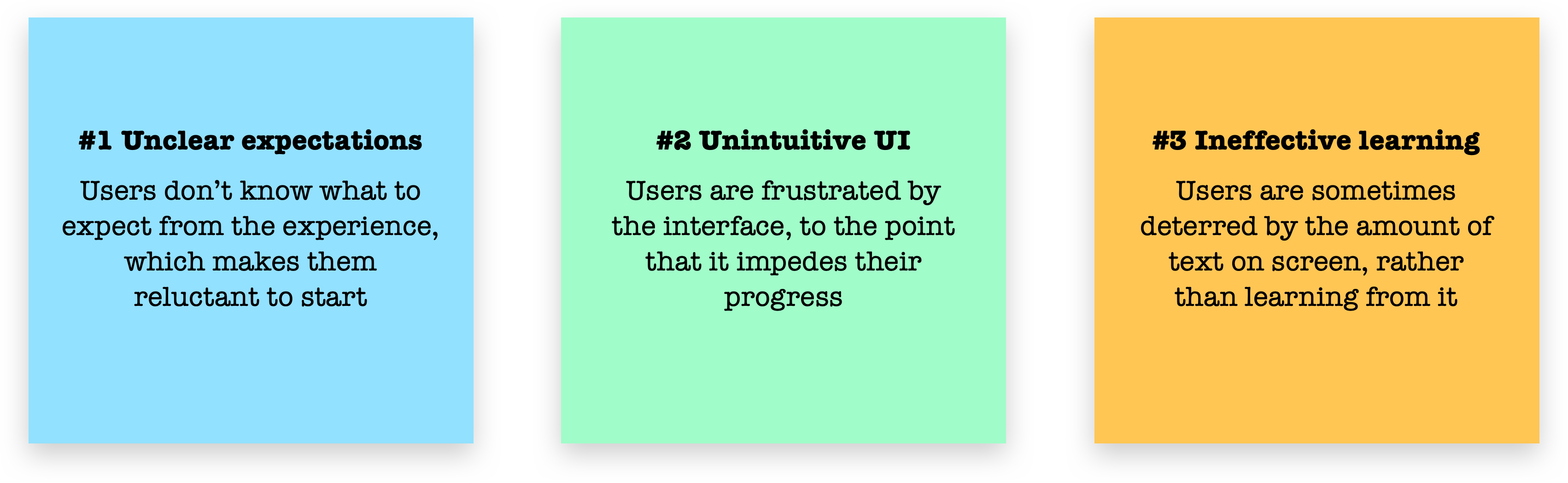
Key Findings
Our research showed 3 main pain points causing engagement drop-off in our experience:
Scoping
Design Goals
To address the pain points found, I identified 3 main focus areas. Under each focus area, I (and the team) brainstormed a list of features that could improve that area:

Prioritization
Next, we sorted the tasks onto an effort/impact matrix. From this, we created our final task list, prioritizing high-impact, low-effort items.

The features would then be released on a rolling basis as they were built, in order of priority.
Design
Below I've highlighted examples of the most impactful designs and system components we created.
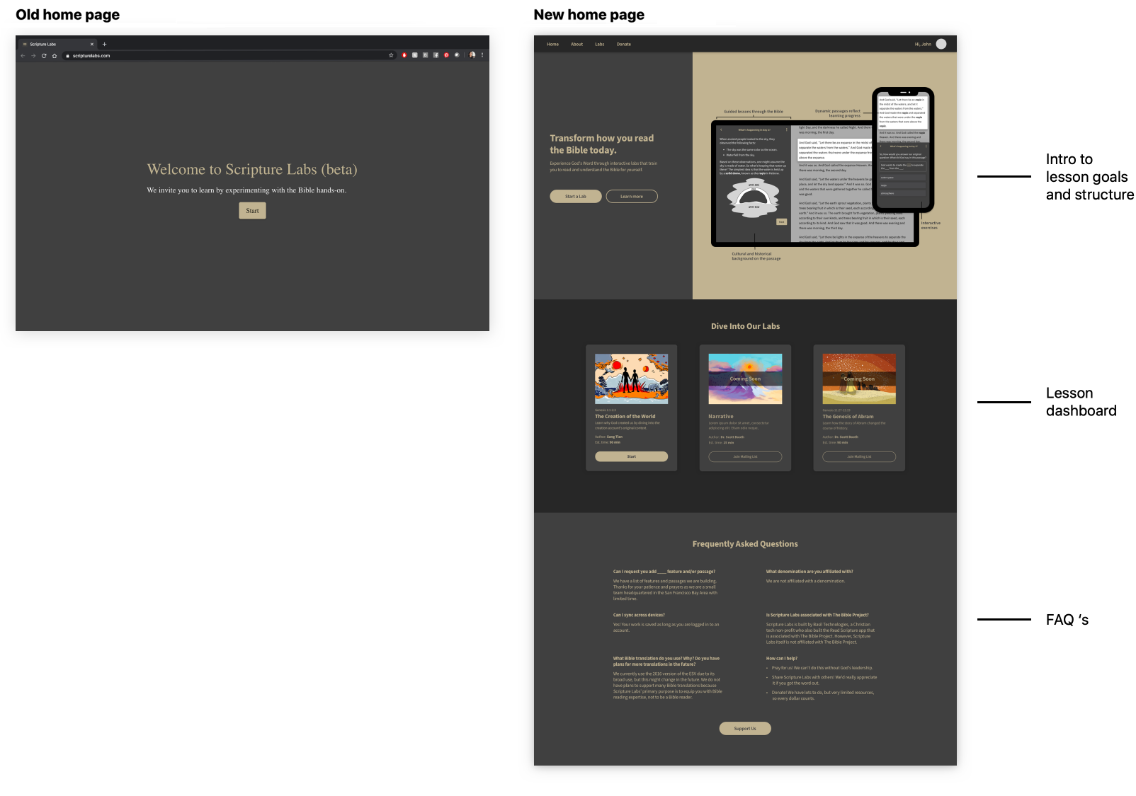
Home Page
The addition of a proper home page provides information about the product, the lesson experience, and—in a future state with more lessons—a place to display them.
Progress Indicators
Added to give students a sense of place and progress. This also incentivizes them to finish.
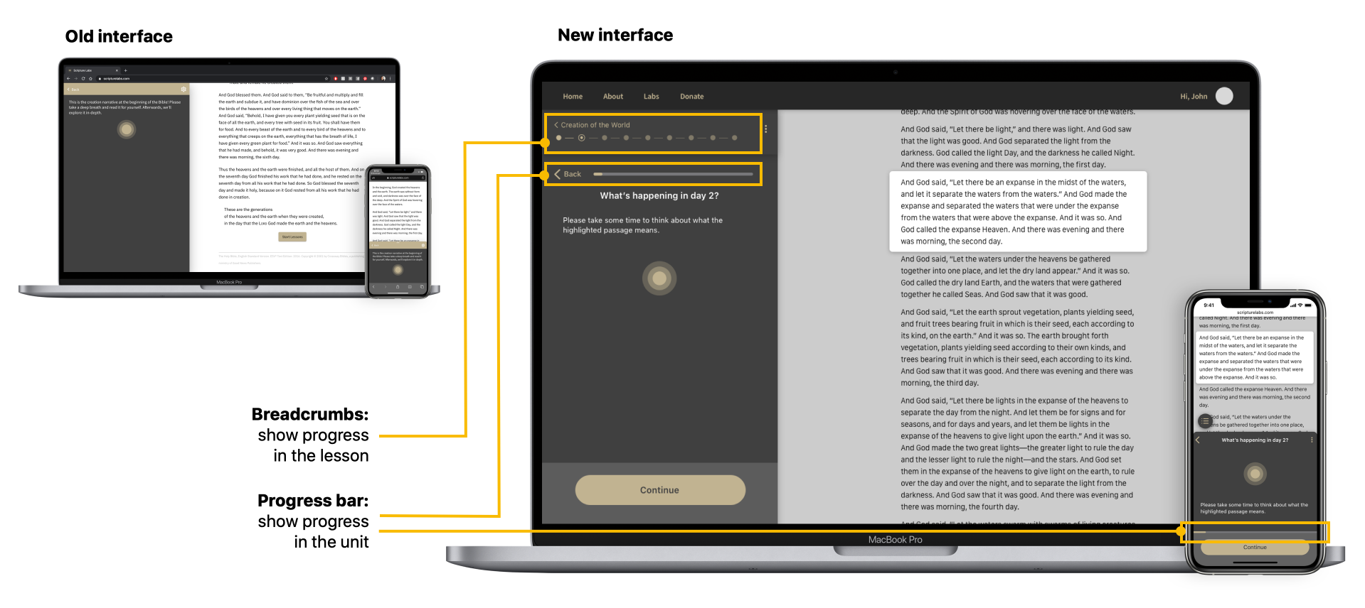
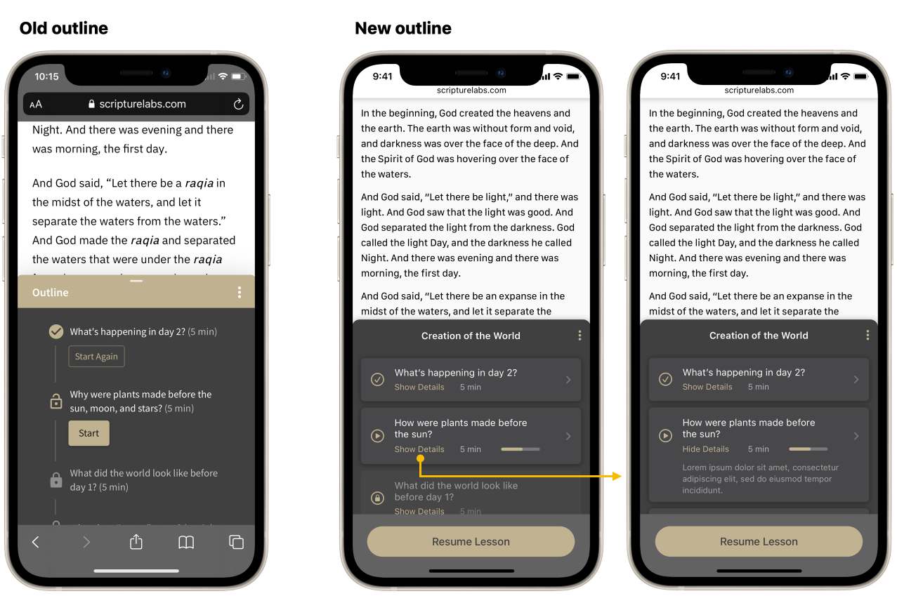
Outline Design
I added additional information to the outline, including summaries and expected completion time, so students could feel more prepared going in.
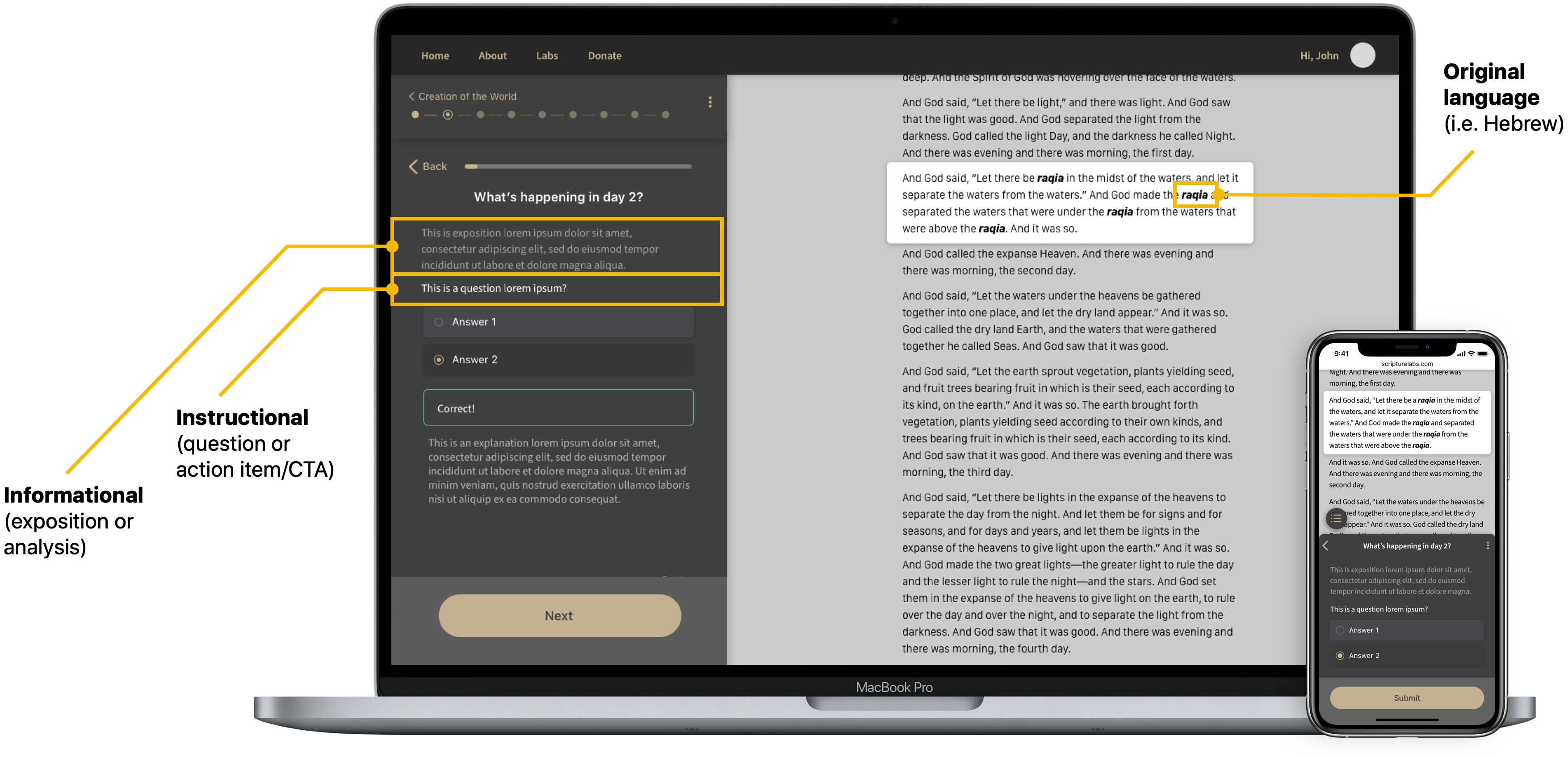
Content Type
To help students more easily distinguish between text-based content, I identified 3 types of content and gave each a different visual treatment. These were:
- 1. Informational: exposition or feedback on an answer
- 2. Instructional: a question or call to action
- 3. Language text: usually words from the original language
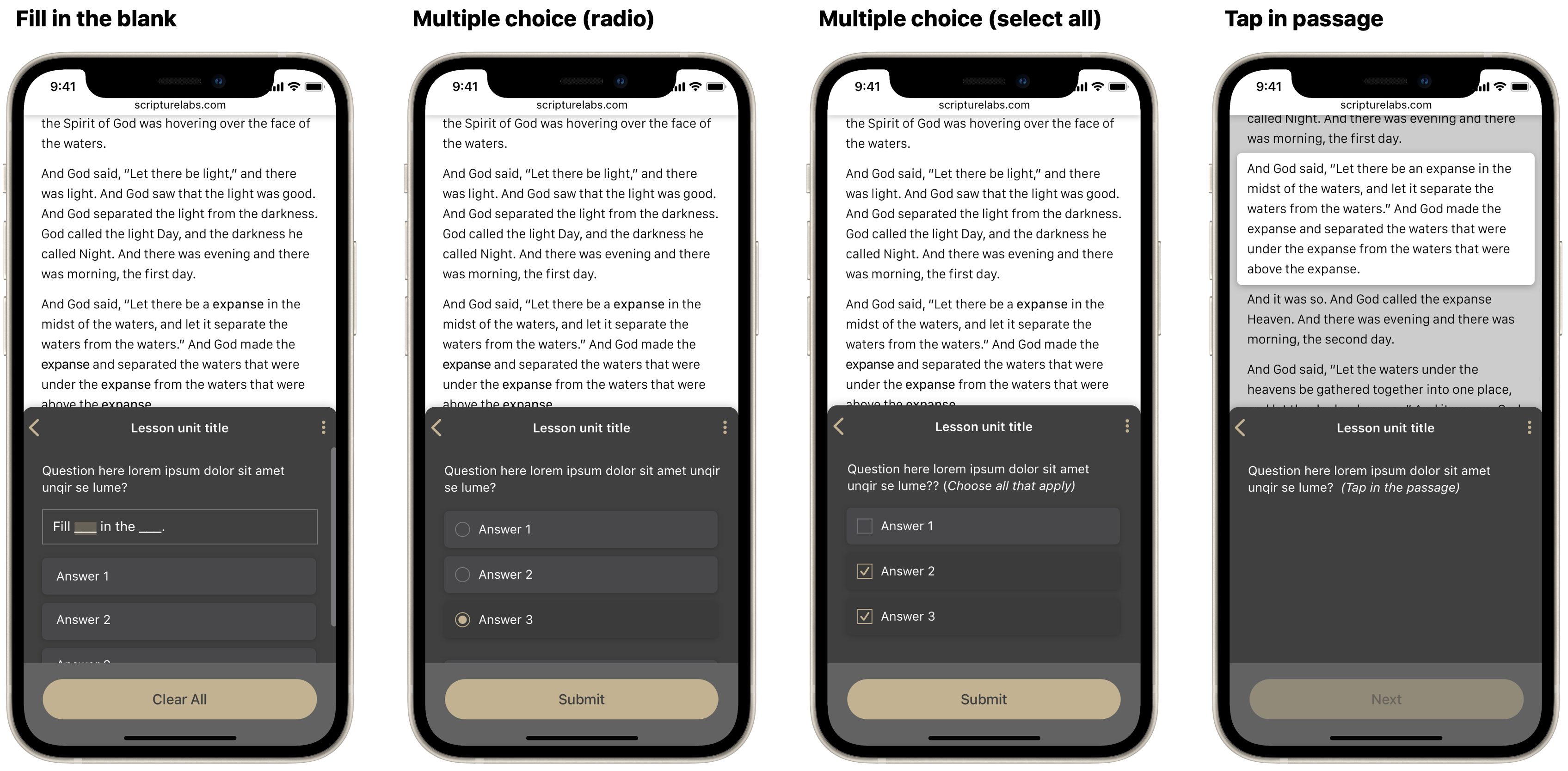
Question Types
A new framework helped bring cohesion to question interactions, reducing friction and incompletion.
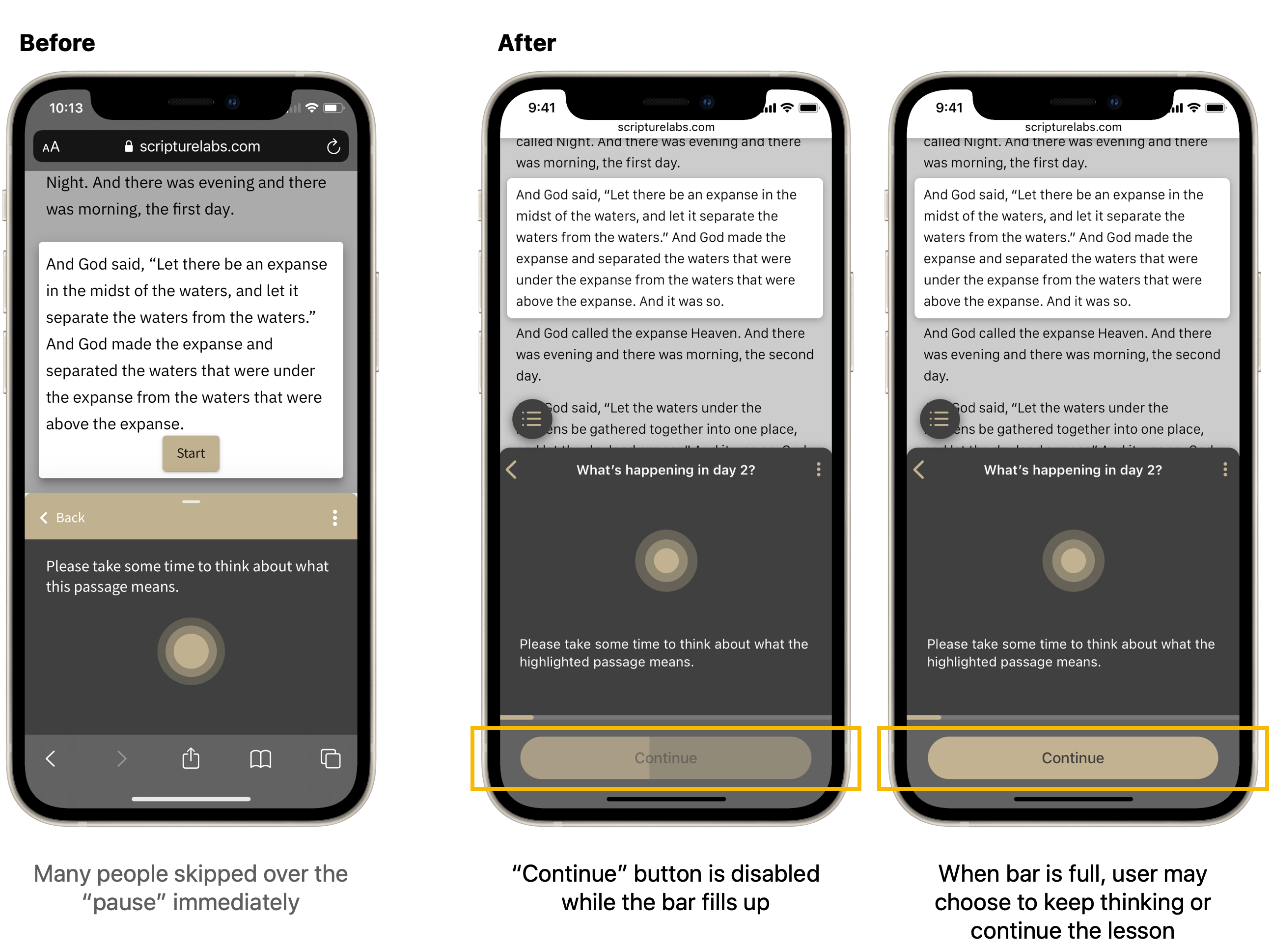
Reading Timer
I created built-in time for pause, aiming to help foster reflection and personal connection with the reading material. This timer design strikes a balance between encouraging participation and giving readers control.
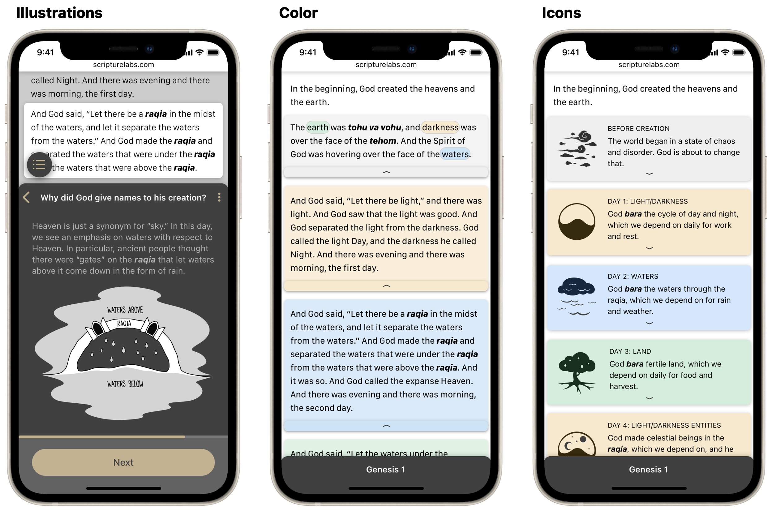
Color & Imagery
I added color and images to parts of the lesson to help illustrate certain concepts.
Results
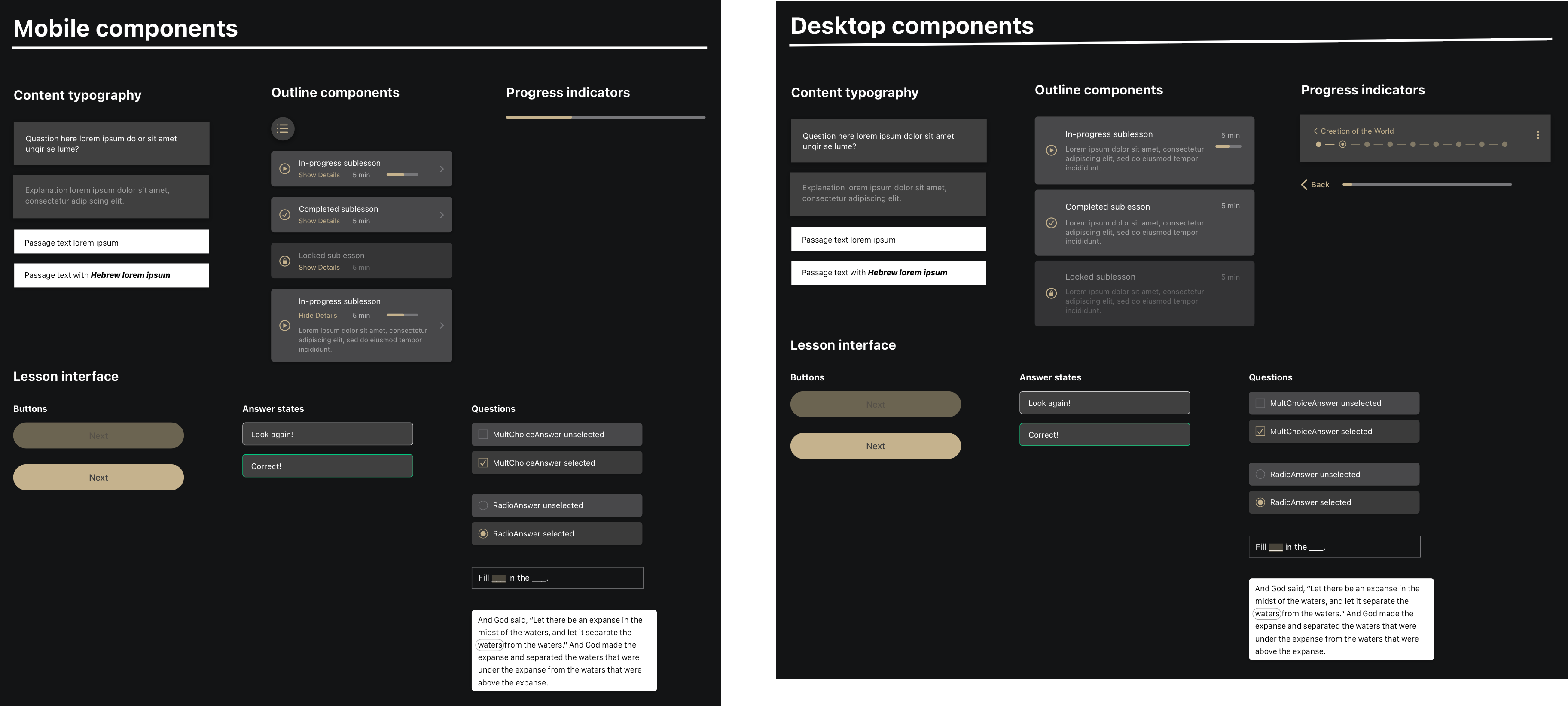
Design System
I created components for the desktop and mobile version. This library will continue to be updated as the product scales.
Improved Retention
The original drop-off points improved by over 10% retention—with the growth in scale, this shows an impact on hundreds of people. Furthermore, we saw fewer comments about the UI, while discussion around the content itself increased, which is desired.
New Drop-Offs
We also saw increased drop-off at a couple points.
1. After the Home Screen: with a push in marketing in 2020, the site received many visits from non-target users.
2. After the lesson outline: this may be the result of adding an option to save progress here, creating a natural stopping point.