Test Results Dashboard
Problem
Data analysts created ad hoc results dashboards after every test, each with its own layout and terminology. This inconsistency added cognitive overhead and lost time on explanation in every review with leadership and business partners.
Outcome
A consistent, intuitive A/B readout built for leadership and partner reviews, surfacing statistical confidence and a clear recommendation up front.
My RoleLead Designer
AudienceLeadership, product, business partners
Background
Before: Ad Hoc by Default
Every team that ran a test built its own dashboard, and every dashboard made its own call on what counted as a win. Some charted lift against a baseline window, others against a rolling average, and a handful of metrics didn't match their own definitions from one review to the next.
Leadership sat through reviews where the first few minutes were spent just orienting to a new layout before anyone could get to the actual decision. The redesign needed a single template that leadership and partner teams could read the same way, review after review.
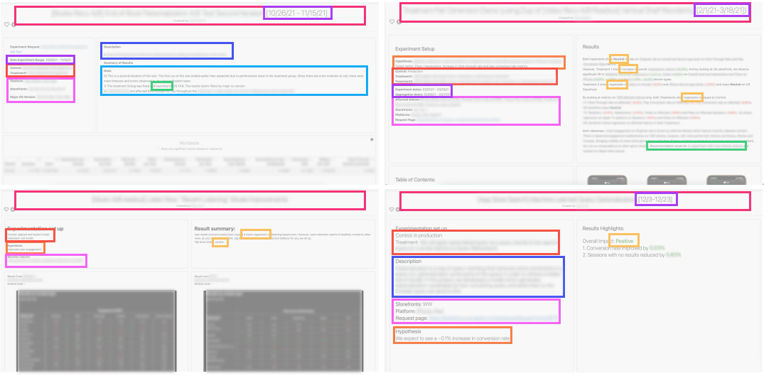
- Outcome/launch decision (or status/progress)
- Test results
- Hypothesis
- Treatments + control
- Experiment + creator name
- Request info
- Experiment date range
- Objective/context
- Misc. notes
Details kept confidential — reach out to inquire about my work 👋